geom_qq2() is a geom for creating quantile-quantile plots with support for
weighted comparisons. QQ plots compare the quantiles of two distributions,
making them useful for assessing distributional balance in causal inference.
As opposed to geom_qq(), this geom does not compare a variable against a
theoretical distribution, but rather against two group's distributions, e.g.,
treatment vs. control.
Usage
geom_qq2(
  mapping = NULL,
  data = NULL,
  stat = "qq2",
  position = "identity",
  na.rm = TRUE,
  show.legend = NA,
  inherit.aes = TRUE,
  quantiles = seq(0.01, 0.99, 0.01),
  .reference_level = NULL,
  ...
)
Arguments
- mapping
Set of aesthetic mappings. Required aesthetics are
sample(variable) andtreatment(group). Thetreatmentaesthetic can be a factor, character, or numeric. Optional aesthetics includeweightfor weighting.- data
Data frame to use. If not specified, inherits from the plot.
- stat
Statistical transformation to use. Default is "qq2".
- position
Position adjustment. Default is "identity".
- na.rm
If
FALSE, the default, missing values are removed with a warning. IfTRUE, missing values are silently removed.- show.legend
Logical. Should this layer be included in the legends?
NA, the default, includes if any aesthetics are mapped.- inherit.aes
If
FALSE, overrides the default aesthetics, rather than combining with them.- quantiles
Numeric vector of quantiles to compute. Default is
seq(0.01, 0.99, 0.01)for 99 quantiles.- .reference_level
The reference treatment level to use for comparisons. If
NULL(default), uses the first level for factors or the minimum value for numeric variables.- ...
Other arguments passed on to layer().
Details
Quantile-quantile (QQ) plots visualize how the distributions of a variable differ between treatment groups by plotting corresponding quantiles against each other. If the distributions are identical, points fall on the 45-degree line (y = x). Deviations from this line indicate differences in the distributions.
QQ plots are closely related to empirical cumulative distribution function
(ECDF) plots (see geom_ecdf()). While ECDF plots show \(F(x) = P(X \leq x)\)
for each group, QQ plots show \(F_1^{-1}(p)\) vs \(F_2^{-1}(p)\), essentially the inverse
relationship. Both approaches visualize the same information about distributional
differences, but QQ plots make it easier to spot deviations through a 45-degree
reference line.
See also
geom_ecdf()for an alternative visualization of distributional differencesplot_qq()for a complete plotting function with reference line and labelscheck_qq()for the underlying data computation
Other ggplot2 functions:
geom_calibration(),
geom_ecdf(),
geom_mirror_density(),
geom_mirror_histogram(),
geom_roc()
Examples
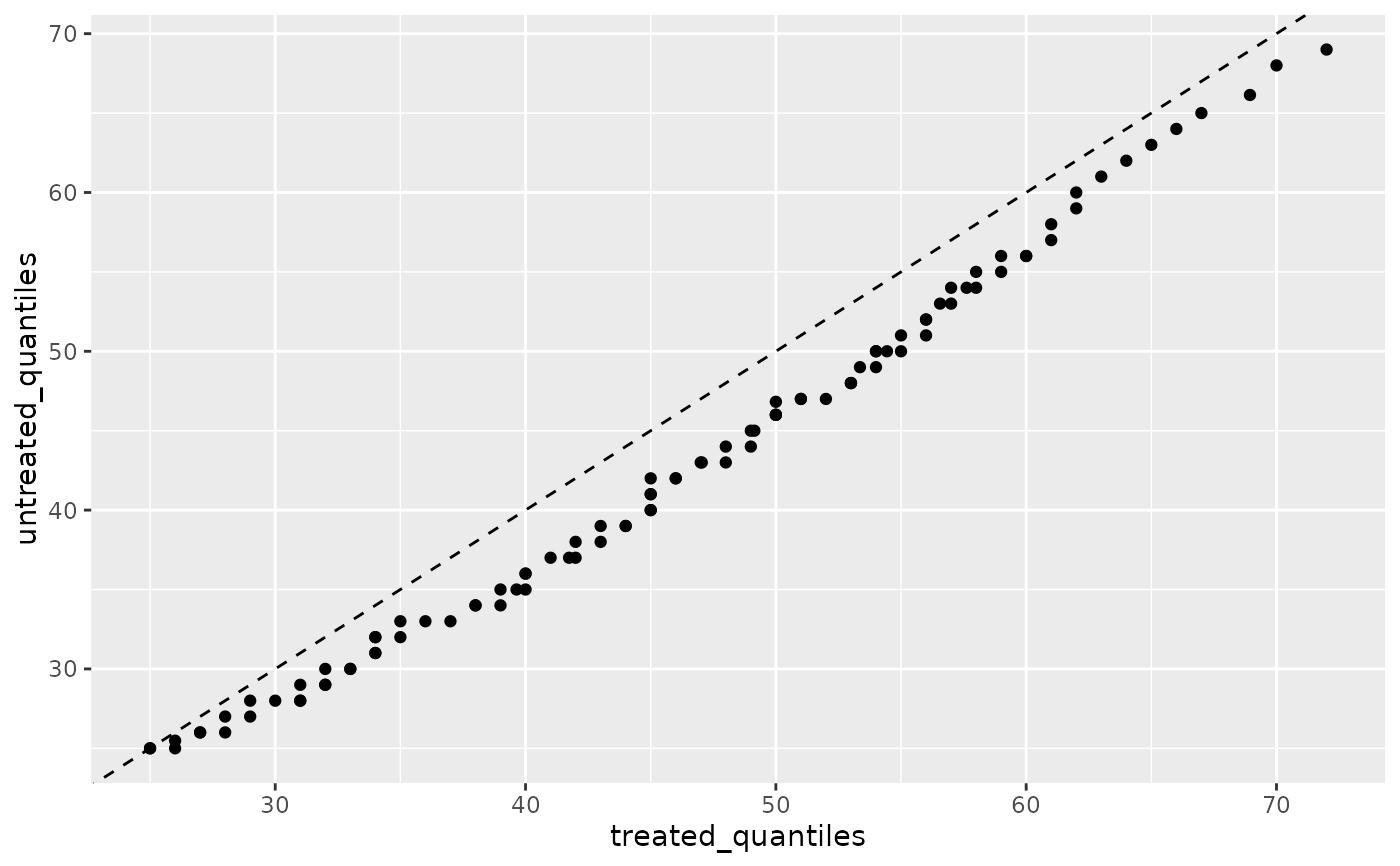
library(ggplot2)
# Basic QQ plot
ggplot(nhefs_weights, aes(sample = age, treatment = qsmk)) +
geom_qq2() +
geom_abline(intercept = 0, slope = 1, linetype = "dashed")
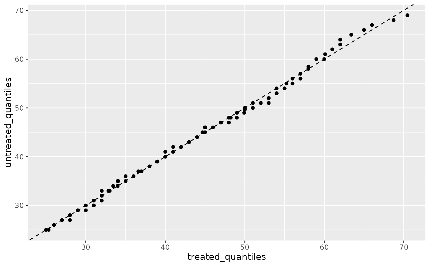
 # With weighting
ggplot(nhefs_weights, aes(sample = age, treatment = qsmk, weight = w_ate)) +
geom_qq2() +
geom_abline(intercept = 0, slope = 1, linetype = "dashed")
# With weighting
ggplot(nhefs_weights, aes(sample = age, treatment = qsmk, weight = w_ate)) +
geom_qq2() +
geom_abline(intercept = 0, slope = 1, linetype = "dashed")
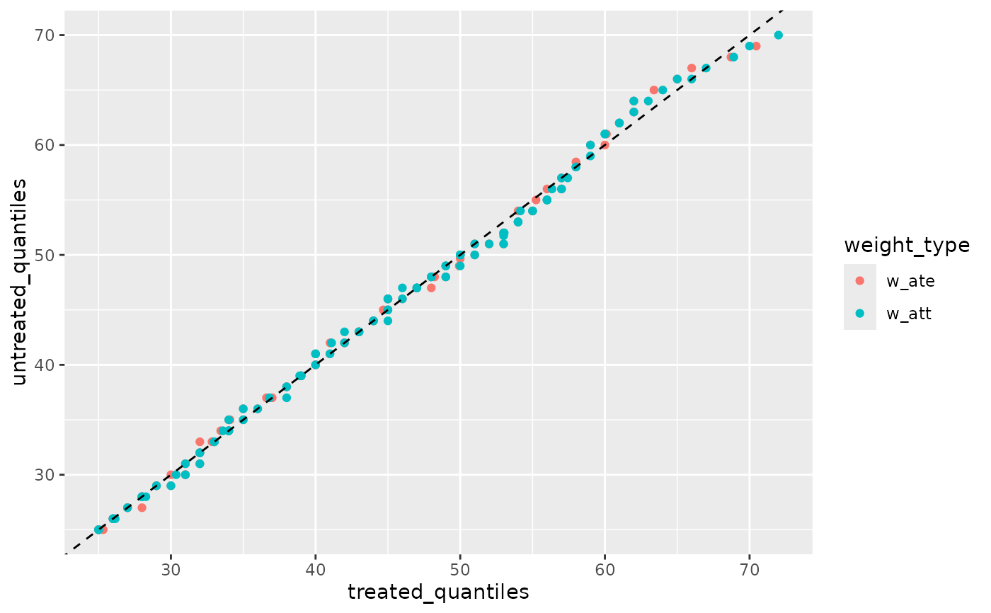
 # Compare multiple weights using long format
long_data <- tidyr::pivot_longer(
nhefs_weights,
cols = c(w_ate, w_att),
names_to = "weight_type",
values_to = "weight"
)
#> Warning: Converting psw to numeric: incompatible estimands 'ate' and 'att'
#> ℹ Metadata cannot be preserved when combining incompatible objects
#> ℹ Use identical objects or explicitly cast to numeric to avoid this warning
ggplot(long_data, aes(color = weight_type)) +
geom_qq2(aes(sample = age, treatment = qsmk, weight = weight)) +
geom_abline(intercept = 0, slope = 1, linetype = "dashed")
# Compare multiple weights using long format
long_data <- tidyr::pivot_longer(
nhefs_weights,
cols = c(w_ate, w_att),
names_to = "weight_type",
values_to = "weight"
)
#> Warning: Converting psw to numeric: incompatible estimands 'ate' and 'att'
#> ℹ Metadata cannot be preserved when combining incompatible objects
#> ℹ Use identical objects or explicitly cast to numeric to avoid this warning
ggplot(long_data, aes(color = weight_type)) +
geom_qq2(aes(sample = age, treatment = qsmk, weight = weight)) +
geom_abline(intercept = 0, slope = 1, linetype = "dashed")