Within light there is darkness, but do not try to understand that darkness. Within darkness there is light, but do not look for that light. Light and darkness are a pair like the foot before and the foot behind in walking.
– From the Zen teaching poem Sandokai.
The goal of halfmoon is to cultivate balance in propensity score models.
Installation
You can install the most recent version of halfmoon from CRAN with:
install.packages("halfmoon")You can also install the development version of halfmoon from GitHub with:
# install.packages("devtools")
devtools::install_github("r-causal/halfmoon")
Example: Weighting
halfmoon includes several techniques for assessing the balance created by propensity score weights.
library(halfmoon)
library(ggplot2)
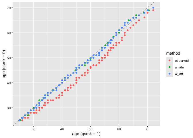
# weighted mirrored histograms
ggplot(nhefs_weights, aes(.fitted)) +
geom_mirror_histogram(
aes(group = qsmk),
bins = 50
) +
geom_mirror_histogram(
aes(fill = qsmk, weight = w_ate),
bins = 50,
alpha = 0.5
) + scale_y_continuous(labels = abs)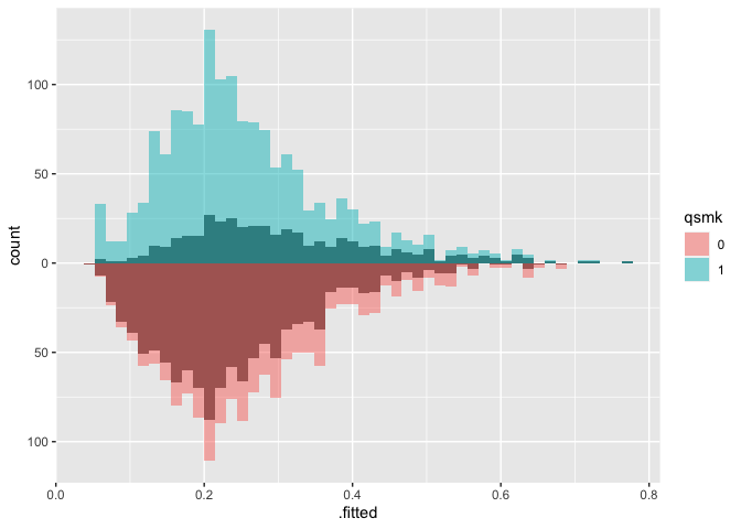
# weighted ecdf
ggplot(
  nhefs_weights,
  aes(x = smokeyrs, color = qsmk)
) +
  geom_ecdf(aes(weights = w_ato)) +
  xlab("Smoking Years") +
  ylab("Proportion <= x")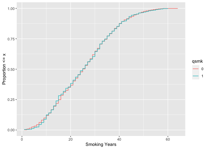
# weighted SMDs
plot_df <- check_balance(
  nhefs_weights,
  race:active,
  .exposure = qsmk,
  .weights = c(w_ate, w_att, w_atm, w_ato),
  .metrics = "smd"
)

ggplot(
  plot_df,
  aes(
    x = abs(estimate),
    y = variable,
    group = method,
    color = method
  )
) +
  geom_love()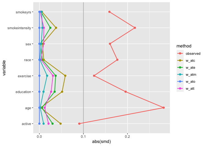
Propensity Score Diagnostics
halfmoon provides comprehensive tools for assessing propensity score model quality through ROC curves, calibration plots, and distributional diagnostics.
ROC Curves
Assess how well your propensity score model discriminates between treatment groups, as well as whether or not the weights create an AUC of about 0.5 (what you would observe from a randomized experiment):
# Check AUC across different weighting methods
roc_results <- check_model_roc_curve(
  nhefs_weights,
  .exposure = qsmk,
  .fitted = .fitted,
  .weights = c(w_ate, w_att, w_atm, w_ato)
)

auc_results <- check_model_auc(
  nhefs_weights,
  .exposure = qsmk,
  .fitted = .fitted,
  .weights = c(w_ate, w_att, w_atm, w_ato)
)

# Plot ROC curves
plot_model_roc_curve(roc_results)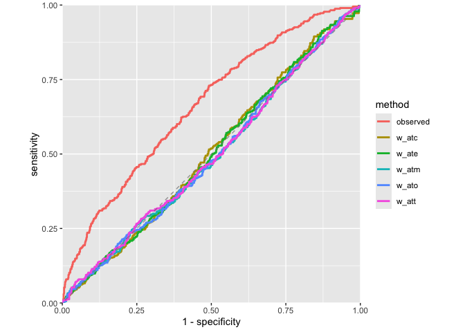
# Display AUC values
plot_model_auc(auc_results)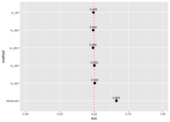
Calibration Assessment
Evaluate whether predicted probabilities align with observed treatment frequencies:
plot_model_calibration(nhefs_weights, .fitted, qsmk)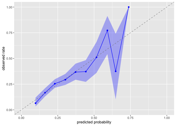
Comprehensive Balance Checking
Assess balance across multiple metrics simultaneously:
# Check balance using multiple metrics
balance_results <- check_balance(
  nhefs_weights,
  .vars = race:active,
  .exposure = qsmk,
  .weights = c(w_ate, w_att, w_atm, w_ato),
  .metrics = c("smd", "vr", "ks", "energy")
)

# Visualize balance across metrics
ggplot(balance_results, aes(x = abs(estimate), y = variable)) +
  geom_point(aes(color = method)) +
  facet_wrap(~ metric, scales = "free_x") +
  labs(x = "Balance Statistic", y = "Variable")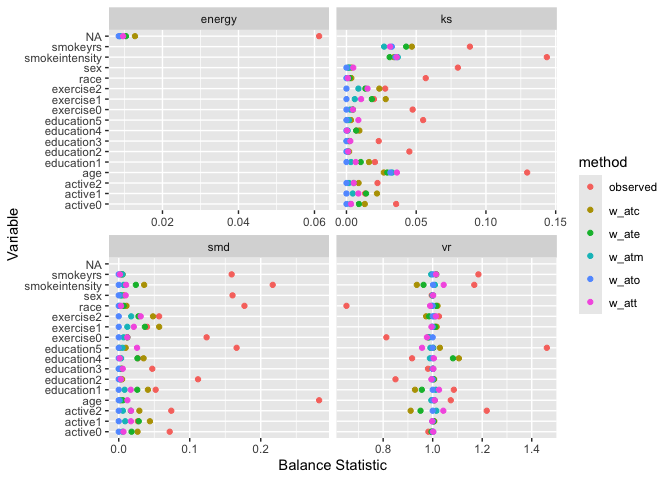
Example: Matching
halfmoon also has support for working with matched datasets. Consider these two objects from the MatchIt documentation:
library(MatchIt)
# Default: 1:1 NN PS matching w/o replacement
m.out1 <- matchit(treat ~ age + educ + race + nodegree +
                   married + re74 + re75, data = lalonde)

# 1:1 NN Mahalanobis distance matching w/ replacement and
# exact matching on married and race
m.out2 <- matchit(treat ~ age + educ + race + nodegree +
                   married + re74 + re75, data = lalonde,
                   distance = "mahalanobis", replace = TRUE,
                  exact = ~ married + race)
One option is to just look at the matched dataset with halfmoon:
matched_data <- get_matches(m.out1)

match_smd <- check_balance(
  matched_data,
  c(age, educ, race, nodegree, married, re74, re75),
  .exposure = treat,
  .metrics = "smd"
)

plot_balance(match_smd)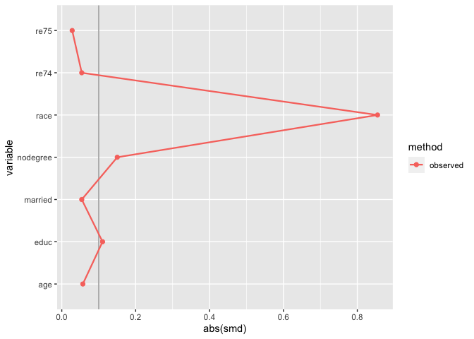
The downside here is that you can’t compare multiple matching strategies to the observed dataset; the label on the plot is also wrong. halfmoon comes with a helper function, bind_matches(), that creates a dataset more appropriate for this task:
matches <- bind_matches(lalonde, m.out1, m.out2)
head(matches)
#>      treat age educ   race married nodegree re74 re75       re78 m.out1 m.out2
#> NSW1     1  37   11  black       1        1    0    0  9930.0460      1      1
#> NSW2     1  22    9 hispan       0        1    0    0  3595.8940      1      1
#> NSW3     1  30   12  black       0        0    0    0 24909.4500      1      1
#> NSW4     1  27   11  black       0        1    0    0  7506.1460      1      1
#> NSW5     1  33    8  black       0        1    0    0   289.7899      1      1
#> NSW6     1  22    9  black       0        1    0    0  4056.4940      1      1
matches includes an binary variable for each matchit object which indicates if the row was included in the match or not. Since downweighting to 0 is equivalent to filtering the datasets to the matches, we can more easily compare multiple matched datasets with .wts:
many_matched_smds <- check_balance(
  matches,
  c(age, educ, race, nodegree, married, re74, re75),
  .exposure = treat,
  .weights = c(m.out1, m.out2),
  .metrics = "smd"
)

plot_balance(many_matched_smds)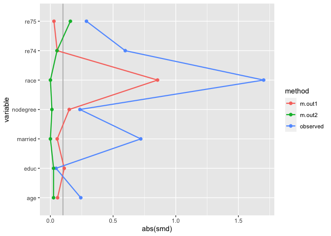
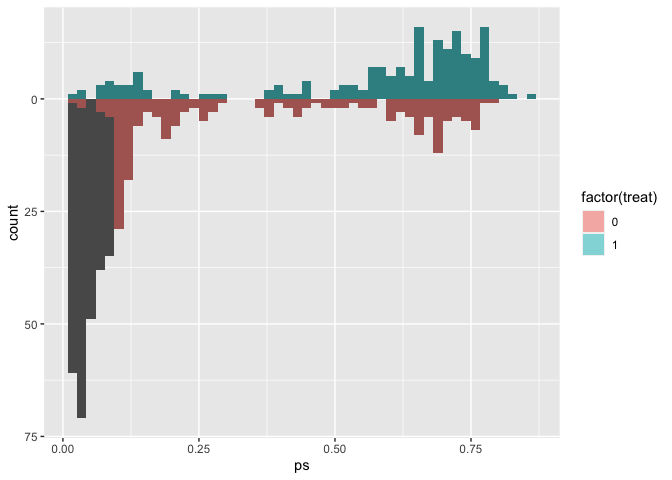
We can also extend the idea that matching indicators are weights to weighted mirrored histograms, giving us a good idea of the range of propensity scores that are being removed from the dataset.
# use the distance as the propensity score
matches$ps <- m.out1$distance

ggplot(matches, aes(ps)) +
    geom_mirror_histogram(
        aes(group = factor(treat)),
        bins = 50
    ) +
    geom_mirror_histogram(
        aes(fill = factor(treat), weight = m.out1),
        bins = 50,
        alpha = 0.5
    ) + scale_y_continuous(labels = abs)