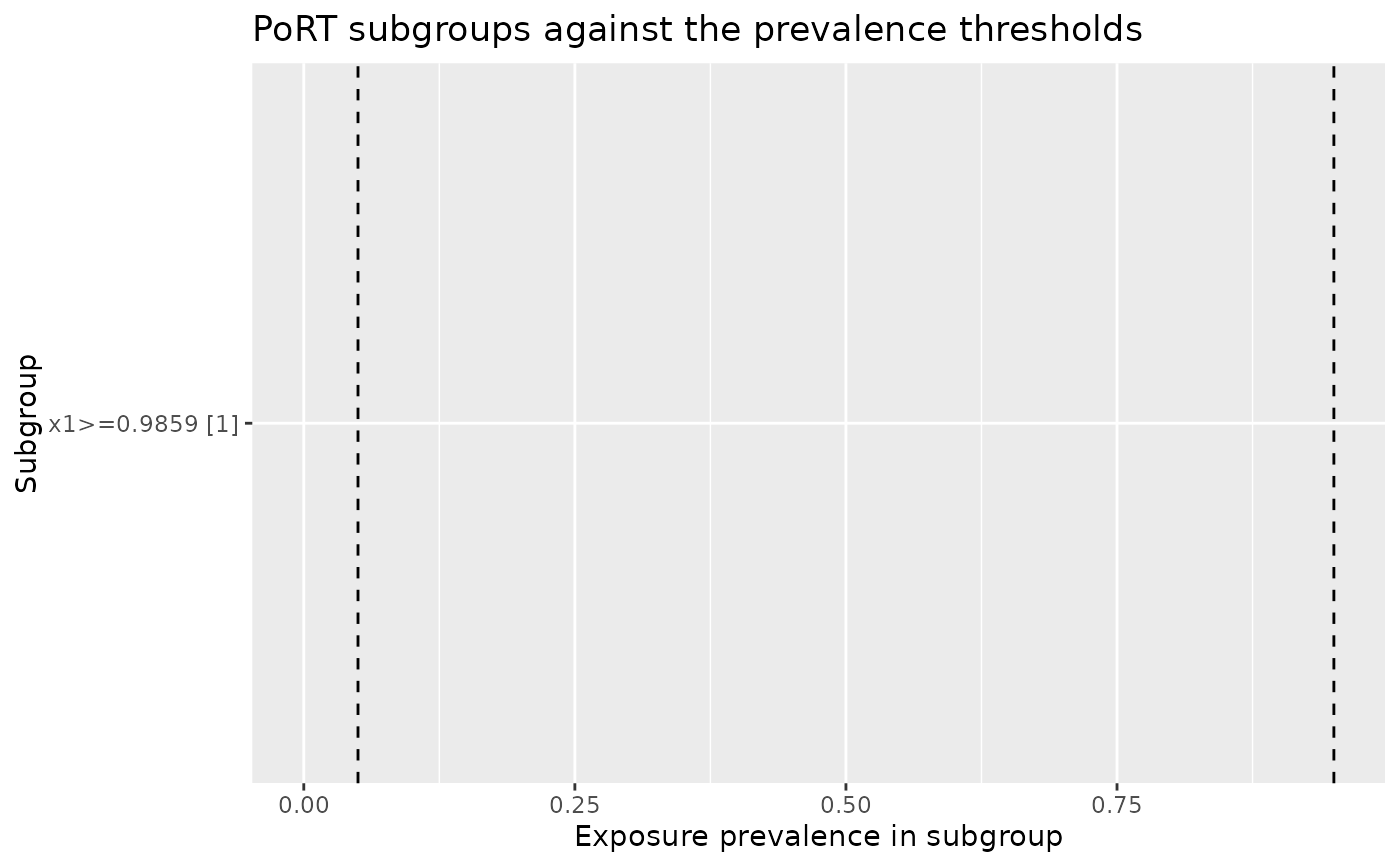
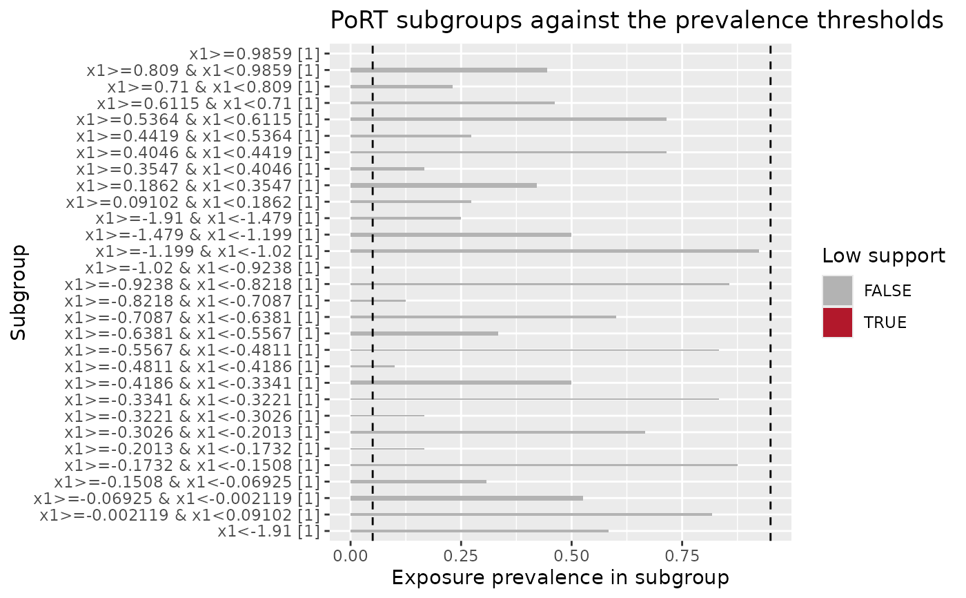
Draws the reported subgroups as a horizontal bar chart of exposure
prevalence, with dashed reference lines at beta and 1 - beta. Bar width
is proportional to subgroup size, and low-support subgroups are highlighted.
A sequential result is faceted by time point, and each facet carries its own
resolved thresholds. A censoring run is faceted by both time point and row
type, so the exposure and censoring subgroups are separated, the censoring
facets plot censoring prevalence, and each facet's reference lines are drawn
from the thresholds that family was judged against. pull_plot_data()
returns the tibble this view draws.
Arguments
- object
A
port_resultfromcheck_port()orcheck_port_seq().- low_support_only
If
TRUE, draw only the low-support subgroups. Defaults toFALSE, which draws every reported subgroup.- ...
Not used.
Value
A ggplot2::ggplot object.
Details
A full result can report hundreds of subgroups, which crowds the y axis.
Setting low_support_only = TRUE draws only the low-support subgroups and
drops the fill legend, while the facets and reference lines are kept, so a
facet without bars means nothing read as low support at that time point.
Examples
set.seed(1)
n <- 400
x1 <- rnorm(n)
exposure <- rbinom(n, 1, ifelse(x1 > 1, 0, 0.5))
df <- data.frame(exposure = exposure, x1 = x1)
result <- check_port(df, exposure, x1)
#> ℹ Treating `.exposure` as binary
autoplot(result)
 autoplot(result, low_support_only = TRUE)