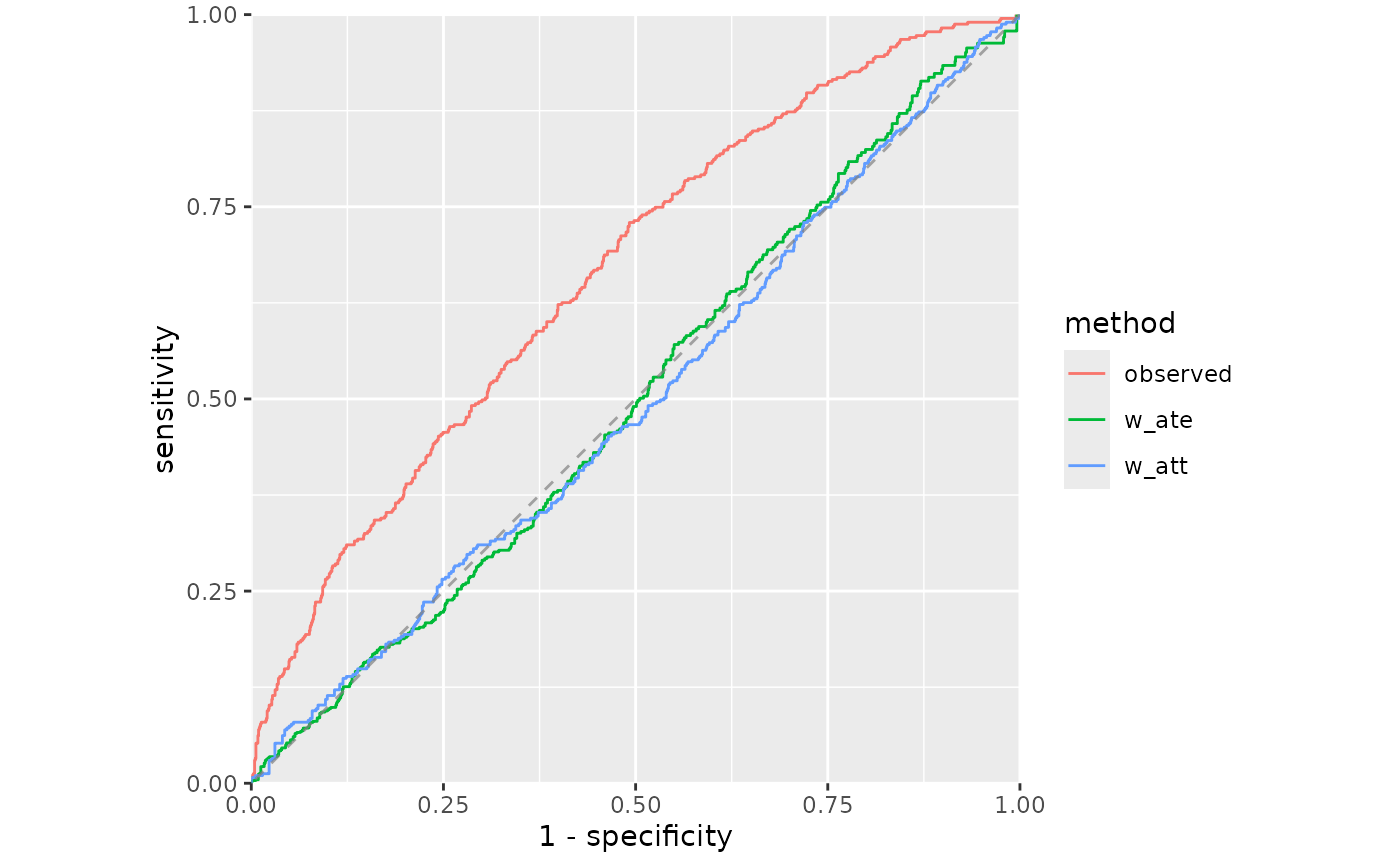
Creates a ggplot2 visualization of ROC curves for evaluating propensity score balance. In causal inference, weighted curves near the diagonal (AUC around 0.5) indicate good balance.
Usage
plot_roc_curve(
  .data,
  linewidth = 0.5,
  diagonal_color = "gray50",
  diagonal_linetype = "dashed"
)
Arguments
- .data
Output from
roc_curve().- linewidth
Width of the ROC curve lines. Default is 1.
- diagonal_color
Color for the diagonal reference line. Default is "gray50".
- diagonal_linetype
Line type for the diagonal. Default is "dashed".
Details
ROC curves for balance assessment plot the true positive rate (sensitivity) against the false positive rate (1 - specificity) when using propensity scores to classify treatment assignment. When weights achieve perfect balance, the propensity score distributions become identical between groups, yielding an ROC curve along the diagonal (chance performance).
Curves that deviate substantially from the diagonal indicate that propensity scores can still discriminate between treatment groups after weighting, suggesting residual imbalance. The closer the curve is to the diagonal, the better the balance achieved by the weighting scheme.