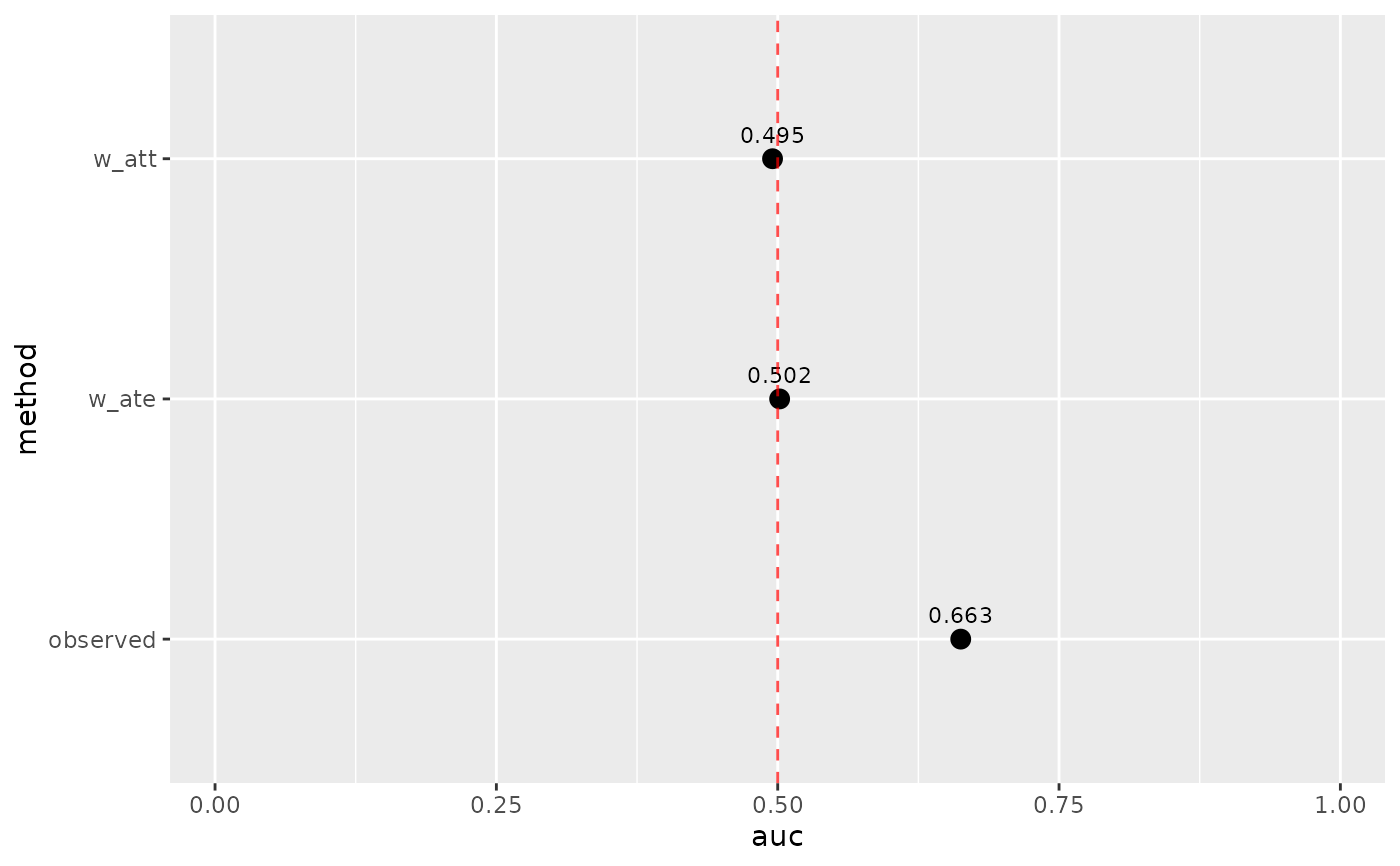
Creates a visualization of AUC values from weighted ROC analysis. Values near 0.5 indicate good balance.
Arguments
- .data
Output from
check_auc().- ref_line
Show reference line at AUC = 0.5? Default is TRUE.
- ref_color
Color for reference line. Default is "red".
- point_size
Size of the points. Default is 3.
- point_shape
Shape of the points. Default is 19 (filled circle).