
Note
This article is translated from the Astrostatistics - Quasar Colorshifts example in the documentation of delicatessen, deli’s Python counterpart.
Astrostatistics - Quasar Colorshifts
The Center for Astrostatistics and Astroinformatics at Penn State Eberly College of Science has a collection of data and tutorials. These tutorials can be found HERE. Here, we will complete aspects of the Sloan Digital Sky Survey (SDSS) quasar survey tutorial. Here the data from the 3rd Data Release (n=46420 quasars) is used.
Here, we will model the quasar colors as functions of spectroscopic redshift. Specifically, we will recreate aspects of Figure 1 of Weinstein et al. (2004). Since these relationships can be non-linear, we will use a generalized additive model.
Load Data
d <- sdss_quasar
d$intercept <- 1
Colorshift u-g
First, we will model ultraviolet (u) and green (g) band shift magnitude. The independent variable here is redshift (z). This model will be fit using a range of splines with a mild penalty. Here, there are many observations, so this model can be quite flexible and still be reasonably fit.
The following estimates the parameters of the generalized additive model being used.
# Spline specifications: NULL for intercept, list for spline term
specs <- list(NULL, list(knots = c(0.5, 1, 1.5, 2, 2.5, 3, 3.5, 4, 3.5, 5, 4.5), penalty = 0.5))

# Define the estimating equation
psi <- function(theta) {
  ee_additive_regression(
    theta = theta,
    X = as.matrix(d[, c("intercept", "z")]),
    y = d$u_mag - d$g_mag,
    specifications = specs,
    model = "linear"
  )
}

# Estimate the model
init_vals <- rep(0, 12)
estr <- m_estimate(stacked_equations = psi, init = init_vals)
Looking at the coefficients of a generalized additive model is not always the most informative. It can be difficult to translate from the coefficients into their meaning. Instead, we will plot the function across a range of values. The following code creates a range of redshift values and then generates predictions according to the estimated model.
# Create prediction data
p <- data.frame(
  z = seq(0, 5, length.out = 200),
  intercept = 1
)

# Generate design matrix for splines with prediction data
Xa_pred <- additive_design_matrix(
  X = as.matrix(p[, c("intercept", "z")]),
  specifications = specs
)

# Generate predicted values from model
yhat <- regression_predictions(Xa_pred, theta = coef(estr), covariance = vcov(estr))
# Plot observed data and fitted curve
observed <- data.frame(z = d$z, colorshift = d$u_mag - d$g_mag)
fitted_curve <- data.frame(z = p$z, colorshift = yhat$predicted)

ggplot(observed, aes(x = z, y = colorshift)) +
  geom_point(shape = ".", color = "lightblue", alpha = 0.2) +
  geom_line(data = fitted_curve) +
  labs(x = "Redshift (z)", y = "u - g")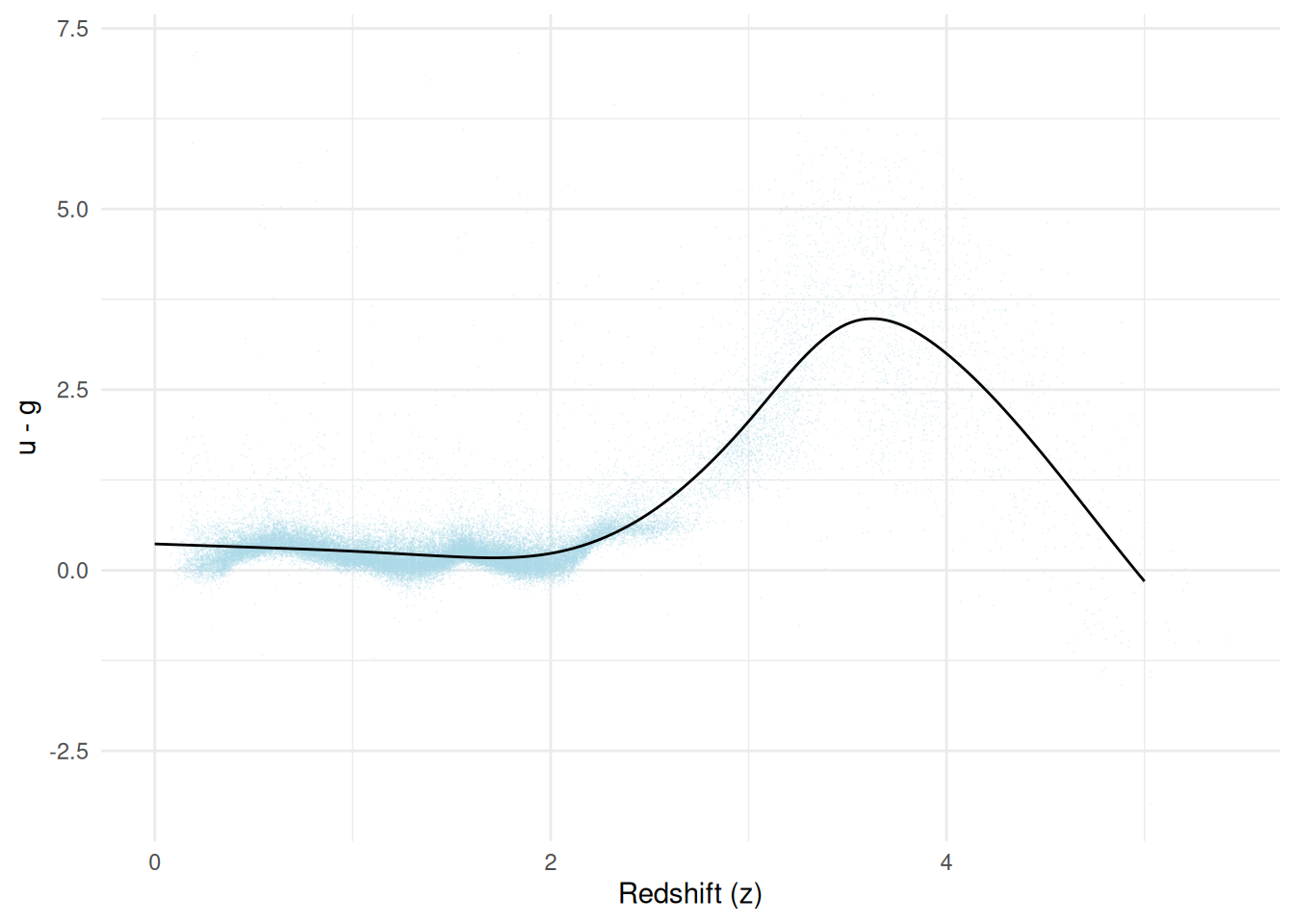
The previous plot shows us a non-linear relationship between redshift and u-g magnitudes. The model appears to agree with the observed data points. The appeal of the generalized additive models is that we can flexibly model quite generally. We see this here, as we did not need to manually specify where we thought the nonlinearity occurs.
A problem with the previous plot is that it doesn’t communicate uncertainty in our estimated function. While we could plot the confidence intervals from the predictions, these would not be appropriate for inference, as they only claim to cover points and not the function. Instead, we will compute the confidence bands and plot those.
# Predicted values from model
y_vals <- yhat$predicted

# Covariance matrix for predictions
cov_p <- Xa_pred %*% vcov(estr) %*% t(Xa_pred)

# Compute confidence bands
cb <- compute_confidence_bands(y_vals, covariance = cov_p, method = "supt", seed = 10177)
# Plot observed data with confidence bands
observed <- data.frame(z = d$z, colorshift = d$u_mag - d$g_mag)
fitted_curve <- data.frame(
  z = p$z,
  colorshift = yhat$predicted,
  lower = cb[, "lower"],
  upper = cb[, "upper"]
)

ggplot(observed, aes(x = z, y = colorshift)) +
  geom_point(shape = ".", color = "lightblue", alpha = 0.2) +
  geom_ribbon(
    data = fitted_curve,
    aes(ymin = lower, ymax = upper),
    fill = "black",
    alpha = 0.4
  ) +
  geom_line(data = fitted_curve) +
  labs(x = "Redshift (z)", y = "u - g")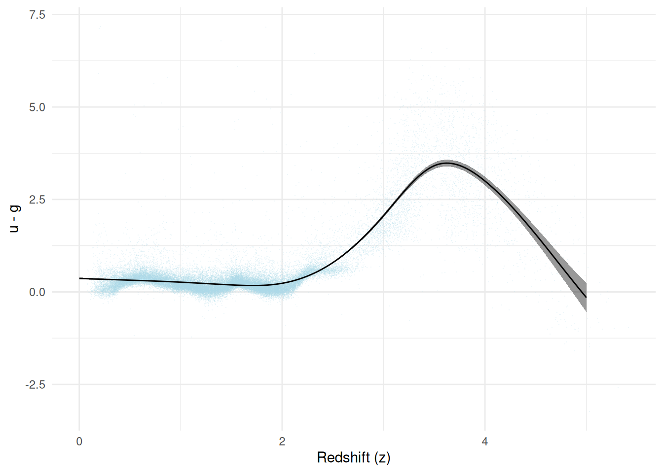
Despite the flexibility of the model, we see our model is quite certain. However, we do see a widening at the higher values of the redshift distribution. Note that these confidence regions only account for random error. They ignore all systematic errors (e.g., measurement error).
Colorshift g-r
Next, we consider the g-r shift.
# Compute the band shift
bshift <- d$g_mag - d$r_mag

# Define the estimating equation
psi <- function(theta) {
  ee_additive_regression(
    theta = theta,
    X = as.matrix(d[, c("intercept", "z")]),
    y = bshift,
    specifications = specs,
    model = "linear"
  )
}

# Estimation
init_vals <- rep(0, 12)
estr <- m_estimate(stacked_equations = psi, init = init_vals)

# Prediction
p <- data.frame(
  z = seq(0, 5, length.out = 200),
  intercept = 1
)
Xa_pred <- additive_design_matrix(
  X = as.matrix(p[, c("intercept", "z")]),
  specifications = specs
)
yhat <- regression_predictions(Xa_pred, theta = coef(estr), covariance = vcov(estr))

# Confidence bands
y_vals <- yhat$predicted
cov_p <- Xa_pred %*% vcov(estr) %*% t(Xa_pred)
cb <- compute_confidence_bands(y_vals, covariance = cov_p, method = "supt", seed = 10177)

# Plotting
observed <- data.frame(z = d$z, colorshift = bshift)
fitted_curve <- data.frame(
  z = p$z,
  colorshift = yhat$predicted,
  lower = cb[, "lower"],
  upper = cb[, "upper"]
)

ggplot(observed, aes(x = z, y = colorshift)) +
  geom_point(shape = ".", color = "deeppink", alpha = 0.2) +
  geom_ribbon(
    data = fitted_curve,
    aes(ymin = lower, ymax = upper),
    fill = "black",
    alpha = 0.4
  ) +
  geom_line(data = fitted_curve) +
  labs(x = "Redshift (z)", y = "g - r")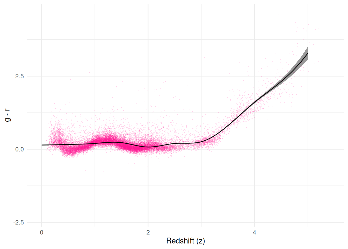
Here, we see more of a hinge point around z=3. Note that we made no change to our generalized additive model specification, again highlighting their general flexibility in applications.
Colorshift g-i
Finally, we consider the g-i bandshift.
# Compute the band shift
bshift <- d$g_mag - d$i_mag

# Define the estimating equation
psi <- function(theta) {
  ee_additive_regression(
    theta = theta,
    X = as.matrix(d[, c("intercept", "z")]),
    y = bshift,
    specifications = specs,
    model = "linear"
  )
}

# Estimation
init_vals <- rep(0, 12)
estr <- m_estimate(stacked_equations = psi, init = init_vals)

# Prediction
p <- data.frame(
  z = seq(0, 5, length.out = 200),
  intercept = 1
)
Xa_pred <- additive_design_matrix(
  X = as.matrix(p[, c("intercept", "z")]),
  specifications = specs
)
yhat <- regression_predictions(Xa_pred, theta = coef(estr), covariance = vcov(estr))

# Confidence bands
y_vals <- yhat$predicted
cov_p <- Xa_pred %*% vcov(estr) %*% t(Xa_pred)
cb <- compute_confidence_bands(y_vals, covariance = cov_p, method = "supt", seed = 10177)

# Plotting
observed <- data.frame(z = d$z, colorshift = bshift)
fitted_curve <- data.frame(
  z = p$z,
  colorshift = yhat$predicted,
  lower = cb[, "lower"],
  upper = cb[, "upper"]
)

ggplot(observed, aes(x = z, y = colorshift)) +
  geom_point(shape = ".", color = "springgreen", alpha = 0.2) +
  geom_ribbon(
    data = fitted_curve,
    aes(ymin = lower, ymax = upper),
    fill = "black",
    alpha = 0.4
  ) +
  geom_line(data = fitted_curve) +
  labs(x = "Redshift (z)", y = "g - i")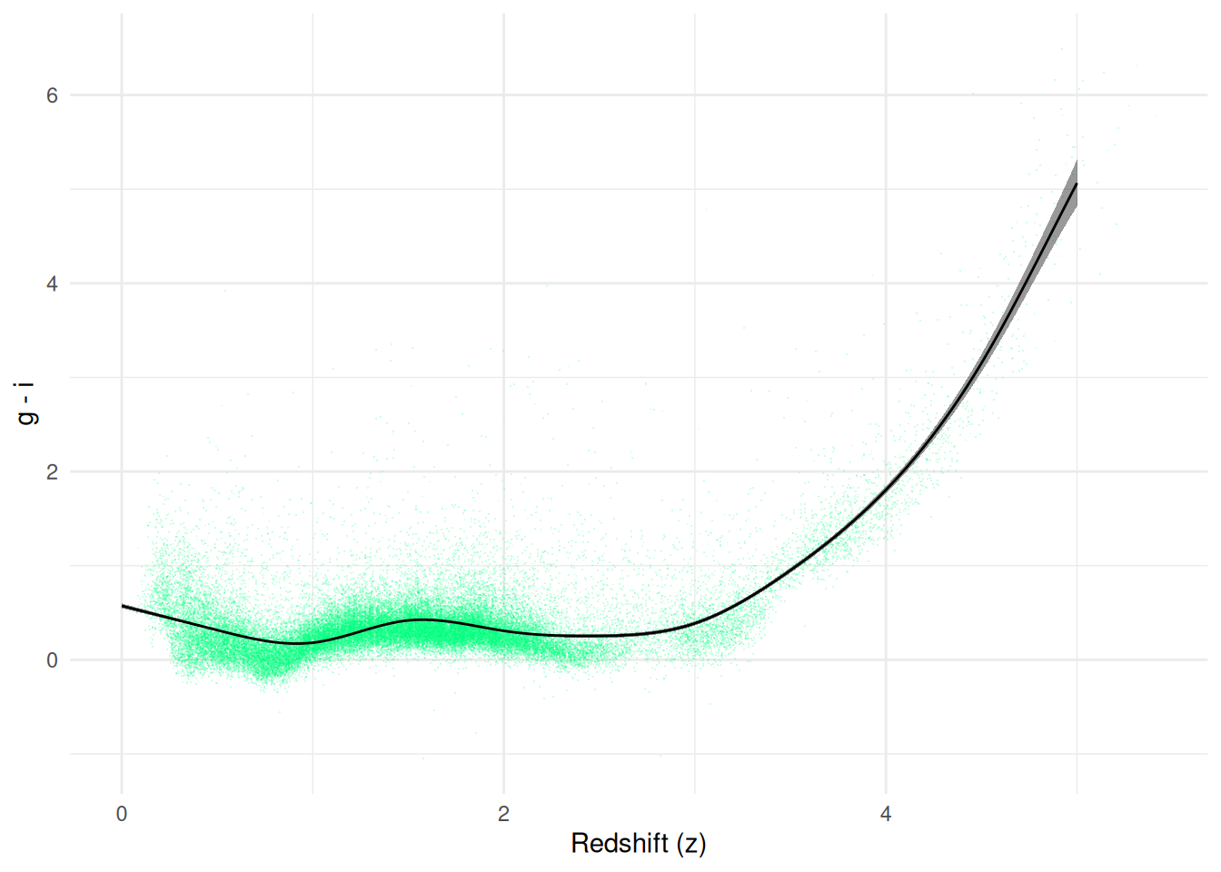
These results are similar to g-r, but the hinge at z=3 is slightly less dramatic. This completes the initial exploration of the quasar data and highlights the utility of flexible regression models.
References
Weinstein MA, et al. (2004). “An Empirical Algorithm for Broadband Photometric Redshifts of Quasars from the Sloan Digital Sky Survey”. The Astrophysical Journal Supplement Series, 155(2), 243.